


1
2
3
4
5
6
7
8
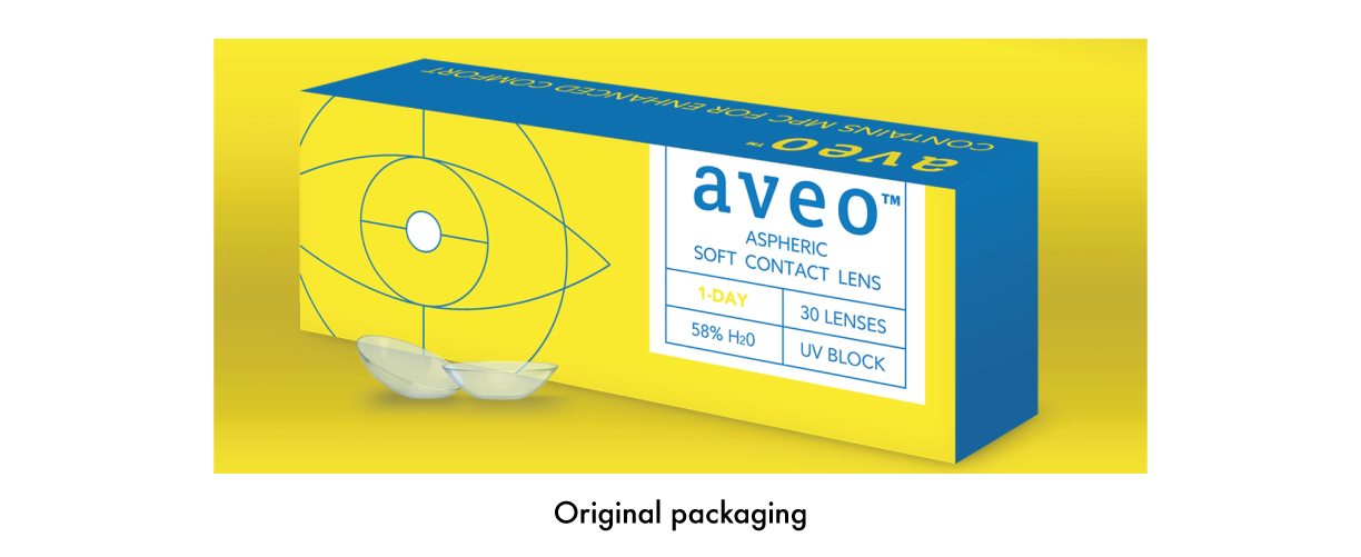
Freelancing project for C2 Creative Studio. My job was to create packaging for Aveo contact lenses new "flagship" product called 365.
The audience is 18-24 year olds and my design had to relate back to the original packaging. The goal was to create a design that was less clinical looking. The big idea was to make something look more current and fashionable.
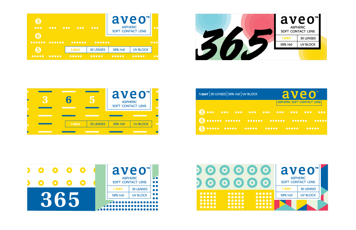
I created concepts for the top of the package. I decided to keep the yellow and blue to help tie it back to the original packaging. I started to play with circles because this shape represents the contact lens and an eye. I then created patterns which are visual representations of 3, 6, and 5. I also simplified the logo lockup and copy to keep the design clean. In the end, these package concepts for Aveo 365 are more fresh and fun compared to other contact lens packaging.
Below are four final concepts that were presented to the client. I am also showing the original packaging I based my design off of and other concepts that led me to my final design so you can see my process of thinking.